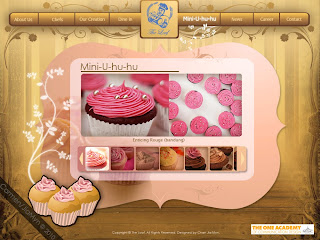
btw.. this is the original website >>>http://theloaf.net/index.php<<< :D
1. What do you think of the mood for this website?
2. What do you think about the color theme of this website?
3. Do you think this overall theme suits the image of The Loaf?
4. Are the text easy to read? and is it comfortable?
5. What do you think of the overall layout?
6. Which page do you like the most? (About page, Chef page, Our Creation page)
7. Do you feel the bread feeling in this website?
8. Last but not least, any suggestion? :D

Intro page
- Users will need to click on the enter button at the bottom to enter the website/mainpage
- The white flower/sakura beside the button will move/animate

Mainpage
- Users will need to click on the buttons, which there are 2 types of buttons in different location but both types function the same. One of them is the menu bar on top, the other is the graphic. If one of them is rollover/mouse over, both types of buttons will have a rollove effect/change effect.
- When users rollover on the graphic button, sakura flowers will appear in animated.


About Page
- There are 2 sub buttons for this page, one is about us and the other is history.
- Users will be able to choose them when they click on it
- The flowers on the left will be animated, same goes to other pages.

Chef Page
- Users can read this page and save down the picture on the right

Our Creation
- Users will be able to view all sorts of bread and pasteries here.
- There are 6 category on the left, when user click on one of the category, the bread thumbnails on the right will change. Then when user choose one of the thumbnail, a bigger version of the bread picture will appear on the right.

Dine In Page
- At the bottom of the page there are 2 types of Menu for the Dine. Both Menu are different, one is for the Langkawi branch of The Loaf, while the other is Pavilion branch. Users will have to click one of them to view the menu

Mini-U-hu-hu
- This is the part where users will have alot of fun in this page.
- This is actually The Loaf special page
- Users can view the cupcakes by clicking one of the thumbnails at the bottom, they can scroll them too.

Career Page
- Users will be able to contact The Loaf to apply jobs
- They can fill up their Job Application first by clicking the job application button bellow

News Page
- Users will be able to read the latest news by clicking on one of the thumbnails, then a pop up window will appear.
- They will be able to read more news by clicking on the "More News" button.

Contact Page
- Users will be able to contact The Loaf from here.
- They are able to locate The Loaf by clicking on the Map of The Loaf
Thanks for the comments and user testing :D
nvm.. keep commenting until i say stop :D
if you aren't able to post the answers for my user testing in the comment form, post it in the Chatbox on your right thanks :D


5 dots:
秋天娃娃~n_n~ says (9:50 PM):
*1. got a very bakery mood
2. the colour is suitable
3. yes
4. yes
5. overall looks warm n comfertable~ like the bread just come out from ovan~ lol~
6. our creation, mini-u-hu-hu n career page~ cos i like to c pic~~ XD
7. yes XD
8. erm... for my suggestion~not really like those icons~ cos the web give me the feeling of smooth n warm~ but the icon is abit too cold n hard for me ;p this is just my
*opinion~ anyway~ good job d>v<b
1. bakery mood horray
2. not bad, its more like bread colour ;D
3. yea
4. yes
5. mmm...bread feeling.... make me feel hungry
6. Chef page and mini-u-hu-hu, i see lotsa various food there
7. yes,obviously
8. i hate to say that, you icon killed the mood D: put colours that can blend nicely with the skin colour. everything done nicely,goodo jobbu
Syaoranloh says (10:15 PM):
*1.ok
2. is suitable
3.yup
4.yup
5. got a warm feeling and somehow feel like in the bakery house.
6. our creation cus it make me feel wanna eat
7.oh ya....babe
8.should change the sakura flower to another flower that suit their country like a flower from france. cus bread come from west not east i dun remember bread come from japan.
clairde says (10:22 PM):
1. warm
2.its nice, looks vintage tho..
3.yea
4.the sentence length is abit too long
5.nice, would like to see it when applied to html :D
6.got, but a bit too flowerish
7.maybe the main page, the menu that havent being selected dont use black, use a desaturated color
1. Nice, like very peaceful!
2. Not bad, the blue and the brown quite match!~
3. Ya
4. Some typo problems but it is ok to read. Ya.
5. Overall is ok.But why the mainpage there those bread are in black? It looks like the bread "long" diao. XD
6. Our creation!
7. yea
8. Everything is quite match but the icon at the bottom right is quite solid. Somemore its animated so i think it will drag more attention than the info. :D:D
sry lah. Ytd too tired and slept dy. >< So now only i post... Kekeke
Post a Comment